Defect frequency plots
See how defect counts rise and spot trends across layers.
Frequency plot
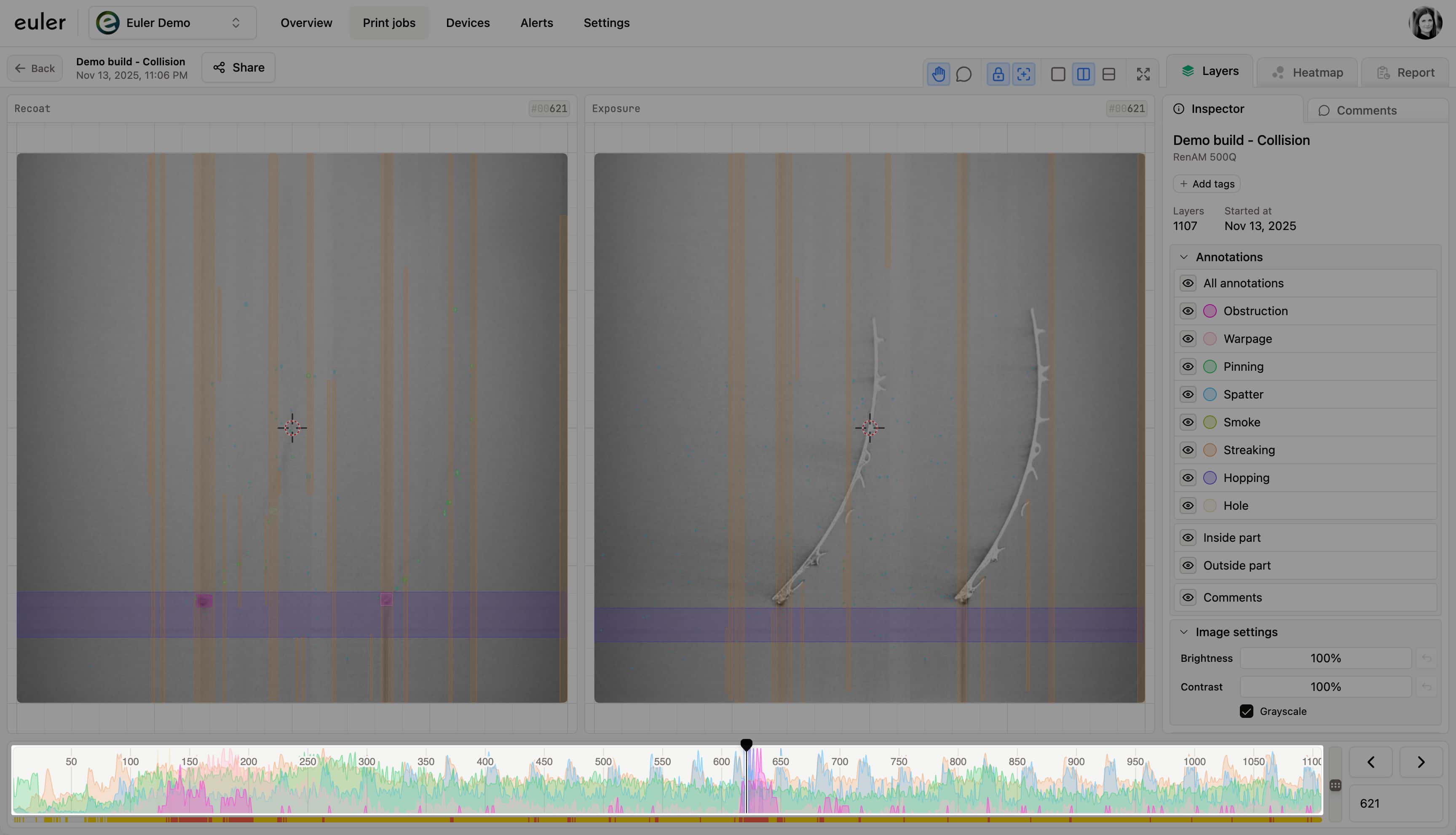
The frequency plot provides a quick overview of how many defects of each type appear on every layer. These plots are normalized so that the highest defect count on any single layer maps to the top of the chart. Because of this normalization, the plots are rarely flat; they reflect the relative variation of defects across layers. This makes it easy to see where defect trends change rapidly, helping you spot layers or regions with sudden increases in defects.
The frequency plot can therefore guide your attention to potential problem areas without requiring you to manually step through every layer.

Scrolling through layers
A scroll handle is displayed in the frequency plot so you can scroll through the layer images.
Focusing on specific defect types
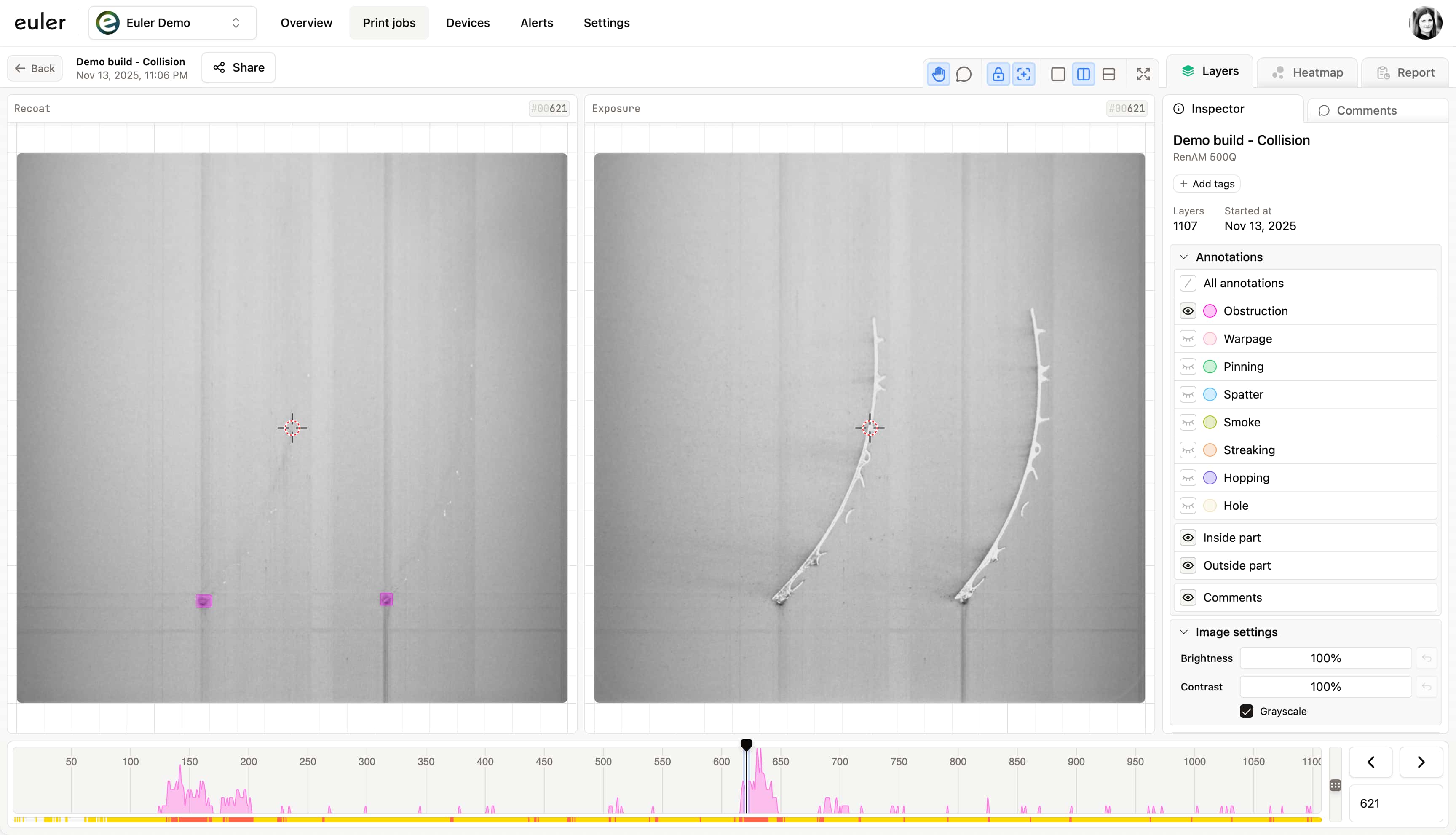
Just like in the layer image, each defect type in the frequency plot can be toggled on or off using the annotation toggle.
Below is an example where only Obstruction is visible in the frequency plot.